

Academy – School Management Dashboard
Overview
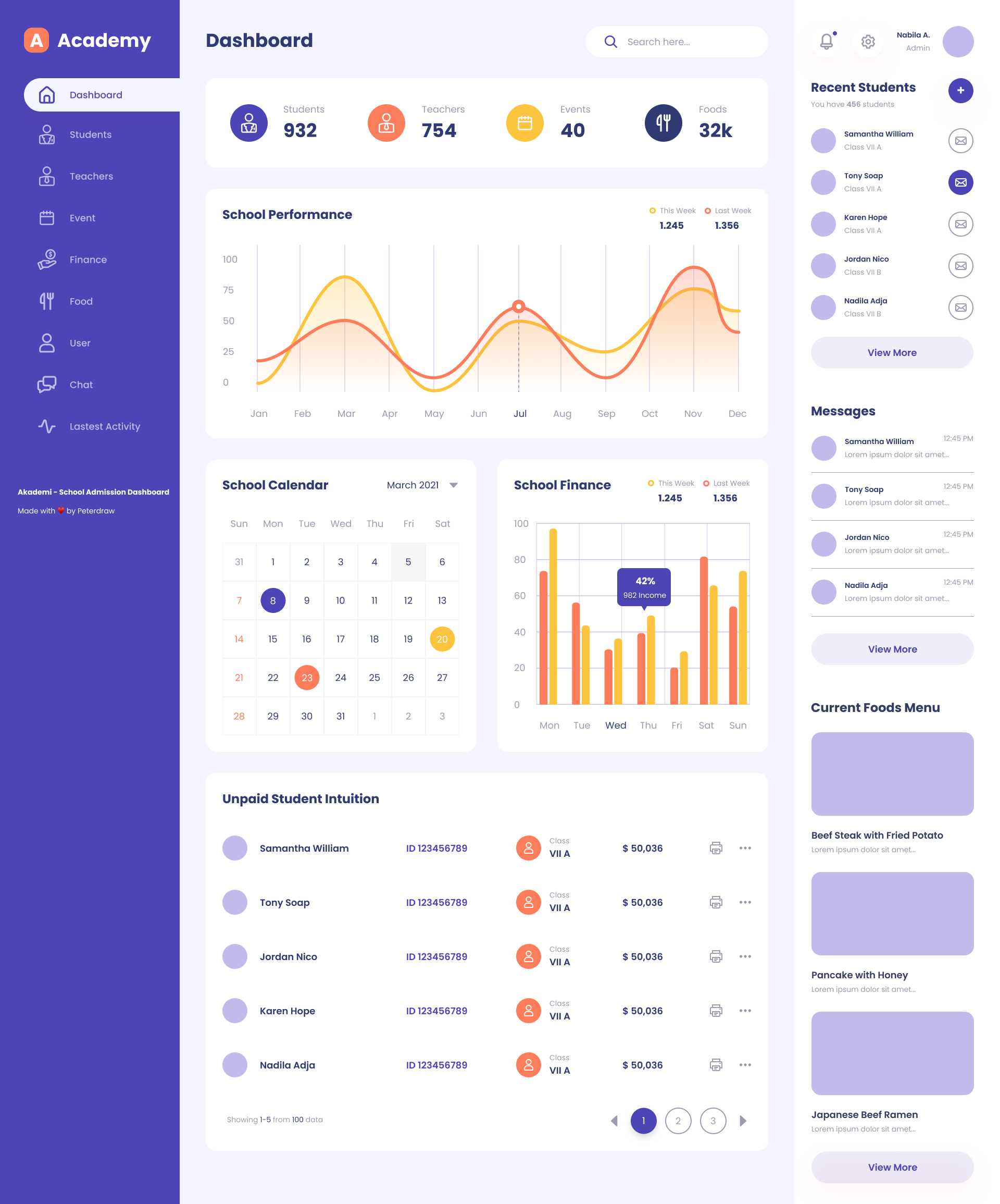
The Academy School Admission Dashboard is a comprehensive and user-friendly interface designed to streamline and centralize school management operations. It offers real-time insights into key metrics such as the number of enrolled students and teachers, upcoming events, and food distribution statistics. With interactive visualizations like performance graphs and financial bar charts, school administrators can easily track academic trends and monitor income and expenses. The dashboard also includes a functional school calendar, a messaging panel for quick communication, and a recent student activity section, all aimed at improving administrative efficiency and enhancing the overall educational experience. Its modern design and intuitive layout make it an ideal solution for schools seeking to optimize their admission and management processes.
Objective
Present key metrics like student count, teacher count, and events in a clear, concise layout.
Improve user experience with an intuitive navigation structure and visually engaging charts.
Design Process
1. Research & Inspiration
I started by analyzing existing school and admin dashboards to identify usability gaps. The goal was to blend simplicity with an aesthetic appeal that suits educational environments.
2. Wireframing
Low-fidelity wireframes were created to define layout hierarchy — focusing on clear navigation, metric visibility, and logical data grouping.
3. Visual Design
The visual direction centered around a soft, friendly aesthetic using shades of purple, orange, and white to evoke trust and energy. Icons are minimalist, ensuring clarity without distraction.
4. Prototyping
Interactive prototypes were developed in Figma to simulate user flow — including dashboard overview, calendar management, and recent activities.
Tools Used
Figma – UI design and prototyping
Adobe Illustrator – Icon and vector asset design
Design Highlights
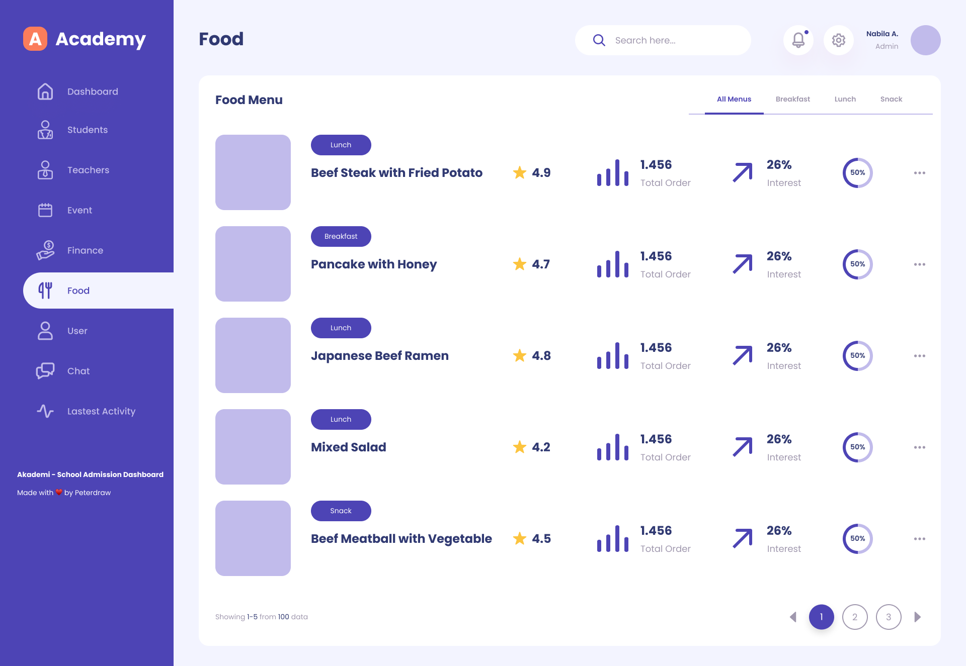
Dashboard Overview: Displays key metrics (Students, Teachers, Events, and Finances) in quick-glance cards.
Performance Graphs: Line and bar charts visualize school performance trends over time.
Calendar Integration: Simple event calendar helps administrators track important dates.
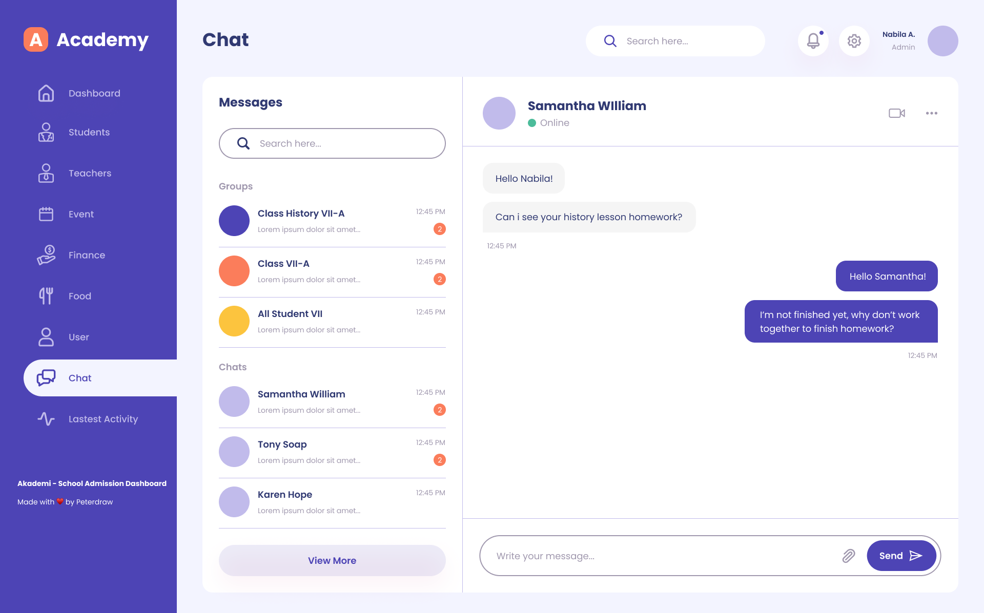
User Section: Lists recent student additions and messages for easy communication.
Sidebar Navigation: Intuitive left-side menu with icons for quick access to all modules.

Events & Schedule Management
The Events Screen provides a structured and visually engaging calendar interface that allows school administrators and teachers to view, manage, and schedule academic and extracurricular activities efficiently.
The design focuses on clarity and ease of navigation — users can quickly switch between months and years, identify upcoming events through color-coded indicators, and access detailed schedule information on the right panel.
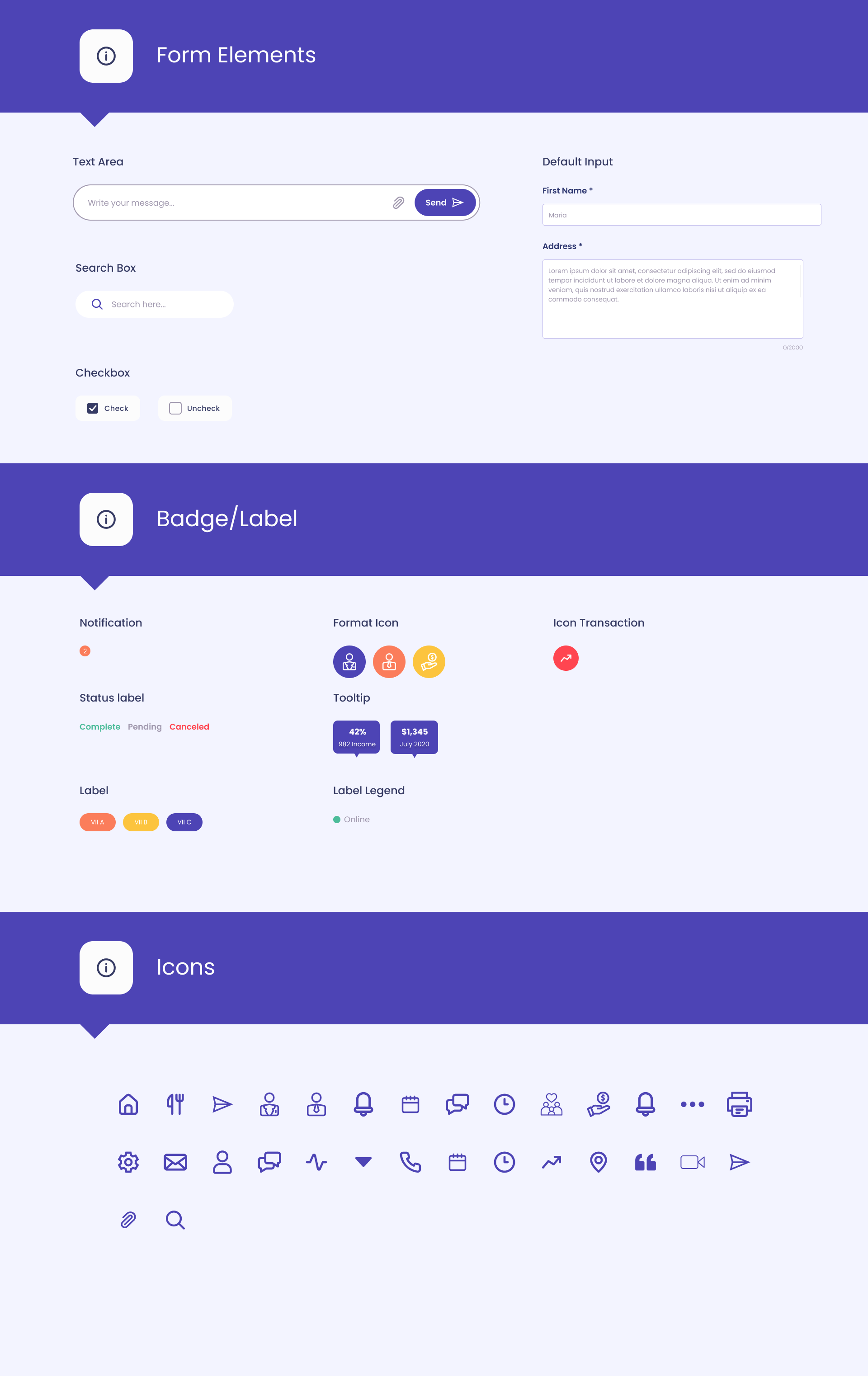
Style Guide

Problem Statement
Schools and educational institutions often struggle with managing and visualizing complex data such as student/teacher counts, school performance, financials, events, and communication. Without a centralized and intuitive interface, administrators may face difficulty in:
Tracking and comparing student vs. teacher statistics.
Monitoring school performance trends and finances effectively.
Managing calendar events and food inventory.
Keeping up with recent student activity and messages.
Ensuring real-time communication and updates.
Key Takeaways
Centralized Dashboard:
Offers an at-a-glance overview of essential school metrics: student count (932), teachers (754), events (40), food stock (32k).
Performance Tracking:
The dashboard includes a school performance graph comparing "This Week" vs. "Last Week" metrics.
Financial graph illustrates monthly income performance with a clear percentage breakdown.
Calendar Integration:
A functional calendar for March 2021 is shown, likely to manage school events and deadlines.
User Interaction:
Recent students section lists new or active students with class info.
Message panel shows recent communication from students or staff.
Modern UI/UX:
Clean, minimal, and user-friendly design for efficient navigation and quick insights.
Conclusion
The Academy School Admission Dashboard effectively addresses the administrative needs of educational institutions by integrating key data points into a single, user-friendly platform. It enhances decision-making by providing real-time insights into student/teacher ratios, financial trends, events, and communication. This kind of dashboard can greatly improve operational efficiency, transparency, and responsiveness in a school environment.